
 Trawling through the negs to find the first six instalments of Clarke’s Beach I start to dally. The dalliance is due to those negs that have never seen a negative carrier, those negs that I have been meaning to print but never got around to them. They were now far enough removed that while I remember taking them I don’t specifically remember the situations. I do know that they are different than what I am choosing for the show this summer.
In the other individual shows that I have on the rock, I have been a bit wordy in my images. The first one at the gallery when I was hanging some 50 odd prints, I remember Baird coming through, looking and saying Mies van de Rohe.
Less is more.
At the Gander Arts and Cultural Centre. There were at least that many. Come to think of it the space was about the size of the new James Baird > Pouch Cove.
In Gros Morne there were too many “rushes” to show at the end.
So this time I thought that I would be like other contemporary artists. Make less and make them big.
With the small space, that I was originally offered I was thinking eight images - 40x32inches – made from the Parks Canada residency. I was thinking Ikons and had edited down to the eight without a problem – wandering with a heavy camera is made for the searching out of things important.
When I was moved to the large space, again there wasn’t a problem as there were images that I printed – this is where all those postcards come in – which work in a similar vein. They are a bit more whimsical but still pretty straight forward. The ballpark in Bauline, the playhouse in front of the garden shed in Winterton, the close line from the lower deck of the pipe house, a woodpile.
What I was noticing while looking for victims for Clarke’s Beach, were images that were more what I think I do – notations in passing – if I can steal the title of a Nathan Lyons book from the 70’s. the image were more subtle, I allowed for you to miss what I was looking at when I made it. It was less judgmental – as would whenever someone tries to designate something as an ikon.
The sense of the place had to be built up over quite a few images and nothing is really apparent. I realised that I did edit the images in the other shows, but I still needed a number to make my point. while there may have been some in the images themselves, there wasn’t the superfluity between that one would think – I hope - as every image was there to place the others in context.
Having said that though I realise that I need a regulator – hence the references to haiku in the books of wander and just about anything that I send out. It is enough to get my
 idea across but limited enough to make sure that every image stands for something the series – which is different than an ikon where in my opinion the image stands for something outside of the series.
I was a bit innerved as one is always see ikons of the rock – I was looking for something sharp when the tourism board came out with the clothes line segment. It seems that the province is reduced to a series of ikons – cod flakes, rooms, dories, cliffs, icebergs, whales…
Over a bottle or two or ten of Keiths from the beer cellar of the upper pipe house – the scaffolding that hangs over the North Atlantic - my evil twin started rattling off the ikons of my work that he remembered when we started talking about the show.
They weren’t mine.
What this did though was have me break the room into its walls in the hopes of the oh so definitive Gros Morne images will be off set by more subtle ones when I am simply out and about. I’ll have them on opposing walls. So the gigantic dory will be opposite the toy plane windmill up by the Newells. The line disappearing into Bonne Bay will counter a laundry line. The visitor’s dug out in Woody Point will have the home dug out of Heart’s Content (or Desire cannot remember where it was).
On one wall will be the images that Jim sees as ikons – truly fitting here as they are all things - the pinholes from my first visit.
While I was excited before – for some reason this show holds more promise for fun on my part even though the Duke is 15 miles away – but now am more so. I realise that I prefer the image that can be missed, the image with insignificancies, the ones that I see with the periphery of my vision rather than the those stared at.

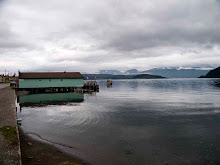
route 80 - heart's desire


4 comments:
intriguing, i like the idea of clarke's beach, interesting, the choice you made here.
the picture that is also an idea like this one is the one of ashland express, a few posts back.
but that is another show.
sonrisas
precisely proving the idea of the way that i like to work. to me ashland and cortland is completely different from (than?)behind sam newell's house.
ashland and cortland is pure formalism to me there is no real subject matter except how everything came together.
behind sam's is significant object laden and to me a metaphor of the place - in a grand scale. i am fully aware that it is filled with inside jokes and meanings that only comoe from looking at more images.
the laundry line as i stated is as much of an object of fascination to me up there as chairs are in the land of the bush wacked.
the toy plane hints as the wind - which is pretty much constant - the airport which is 20 km away and the link to the rest of the world.
the formal crap is secondary. do i expect people to see this? naw especially in one image but i would hope viewers would get an inkling seeing a series.
however, this is nothing like clarke's beach - but that could change - which debuts 8 march.
what i meant was, that ashland corland was something that wasn't stared at as you stated.
it is an interesting photograph to me because it is so insignificant rather than ikons as you say.
i was not including the photos here. only the writing.
i like the choices.
fantastic snappy snaps.
Post a Comment