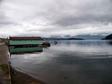
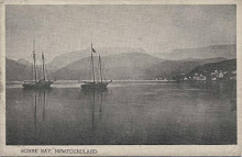
don't know how i came about this but blindly roaming the internet i found a blog from the newest province in canada - that as it happens stopped being a republic to-day in 1949.
this was in the column
The magazine has been redesigned, but the look is ho-hum; change for its own sake. The new sans-serif font (Helvetica, I believe) looks cheap and the point size is too large. The image area of each page is contained within a two-point border (even the advertising is contained in the larger box) which prevents photographic bleeds and inhibits creative layouts. As an example, ‘Clarkes Beach’, a new graphic feature by artist Robert Clarke-Davis, has some potential but right now it’s boxed, tiny and looking too much like an advertisement. Let it breathe, please! Alas, this conservative new design looks more like a low-budget newsletter than a provocative magazine.
to read the rest...
http://meekermedia.blogspot.com/2007/03/new-current-is-drifting-out-to-sea.html
Science and Art
-
The teaching of the sciences and the arts needs to be conjoined and
sustained from the earliest stages of education. In the Foreward to
Platinotype my frie...
2 years ago


1 comment:
I don't like the layout of his blog!
Post a Comment